


The Top Trends in Data Visualization for 2018

1. Data visualization is not just for data scientists anymore
IBM projects a 39% increase in demand for data scientists and data engineers over the next three years. But employers are coming to expect a familiarity and comfort with data across their organizations, not just from their scientists and engineers.
Because of this trend, we can expect the continued growth of tools and resources geared towards making the data visualization field and its benefits more accessible to everyone.
LINK FOTO: http://datavizproject.com/
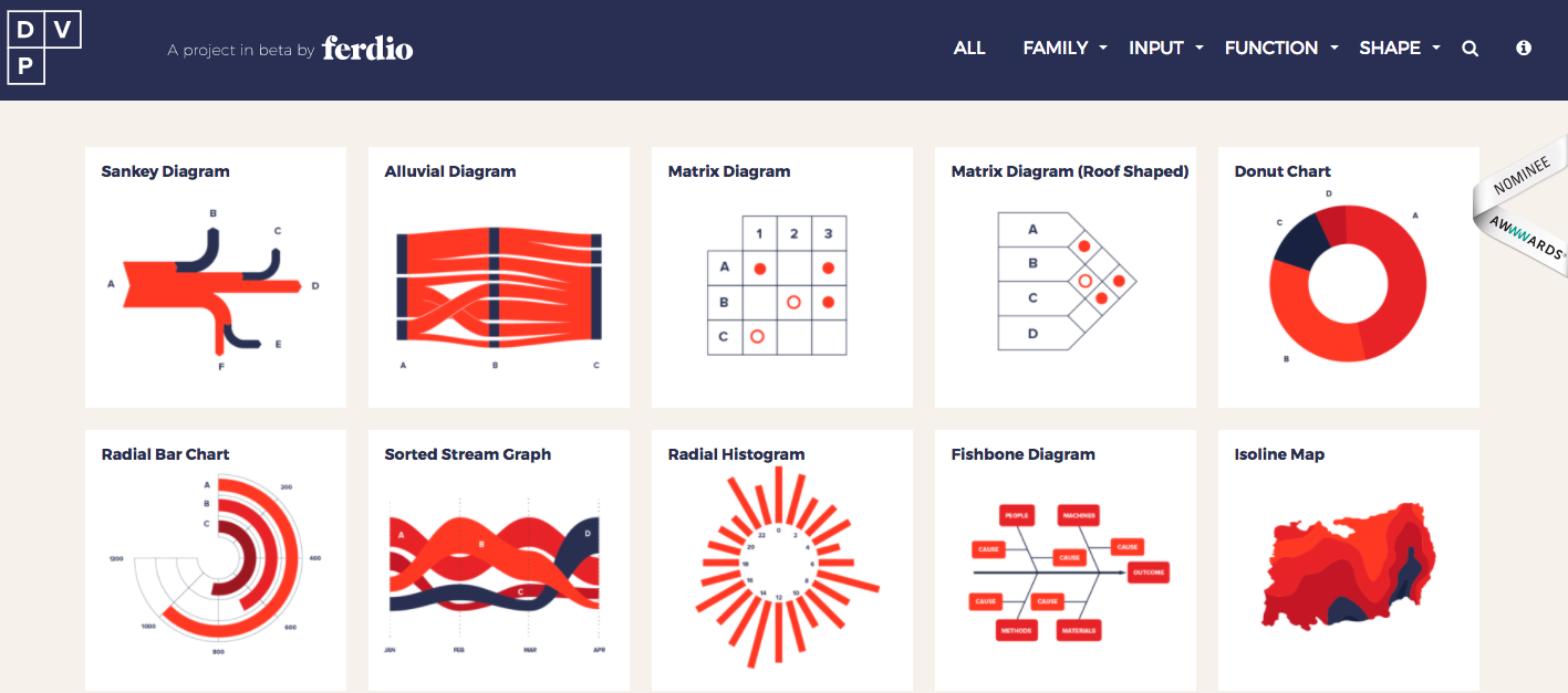
For example, someone new to the field may turn to Ferdio’s DataVizProject.com, a compendium of over 100 visualization models. The infographic agency put this resource together to “inform and inspire” those looking to build their own data visualizations. Other services like Google’s Data Studio allow users to easily create visualizations and dashboards without coding skills.
2. The increase of both open and private data helps enrich data visualizations
In order to gain greater insight into the actions and patterns of their customers and constituents, organizations need to turn to sources outside of their own proprietary data.
Luckily for data scientists, more and more data becomes available every day, and we can expect the trend of increased availability to continue into 2018.
Data.gov, the United States Federal Government’s open data site, boasts data sets from 43 US states, 47 cities and counties and 53 other nations. In June, Forbes identified 85 US cities that have their own data portals.
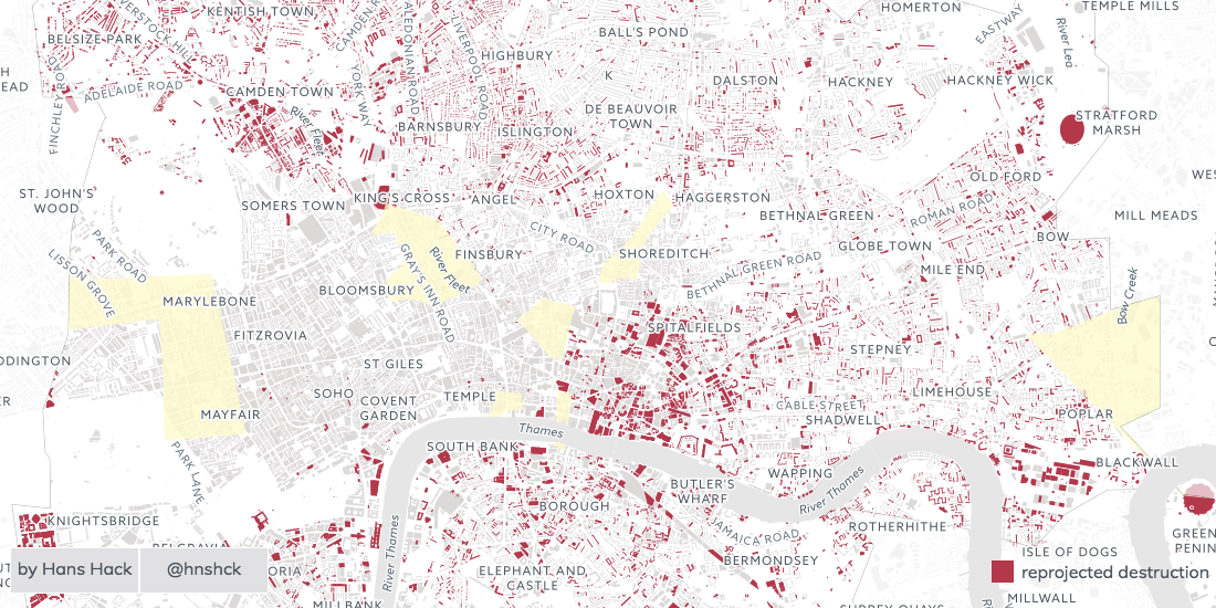
We recently published a list of 40 open data projects, from transportation and accountability to performance management and IoT. In this project users can visualize open data about Cholera outbreaks from WHO using custom iconography and color palette.
In addition to open data sources, new marketplaces, data exchanges such as the new Salesforce Data Studio (announced in September 2017) as well as resources such as CARTO’s Data Observatory, will provide data scientists and visualizers even more opportunities to enhance their data and draw new and actionable insights.
3. Artificial Intelligence and Machine Learning allows data professionals to work smarter not harder
Artificial Intelligence and Machine Learning are the buzz words du jour in the tech world and that includes their use in the field of data science and visualization. Salesforce has certainly highlighted their use, advertising their EINSTEIN AI, which will aid users in discovering patterns in their data.

Microsoft has recently announced similar enhancements to Excel, expected in 2018. Their “Insights” upgrade includes the creation of new data types in the program. For example, the Company Name data type will automatically pull in such information as location and population data using their Bing API. They are also introducing Machine Learning models that will assist with data manipulation. These updates will empower Excel users, already familiar with the programs data visualization tools, with data sets that are automatically enhanced.
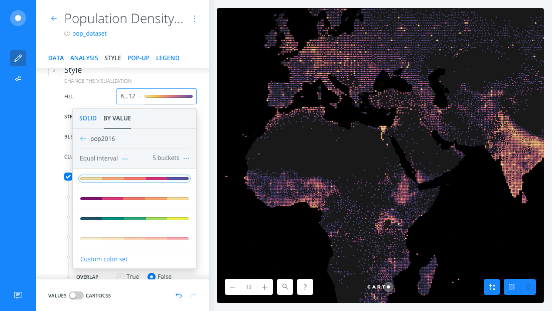
4. The “interactive map” is becoming a standard medium for data visualizations
Data visualization, as a term, can refer to any visual representation of data. However, with the growing amount and prevalence of location data, more and more data visualizations require an interactive map to fully tell a story with data.
We recently shared 80 examples of data visualizations using location data and maps.
Source: https://carto.com/blog/top-trends-data-visualization-2018/